2 conformal
- Mercator
- Asia Lambert Conformal
2 equal area
- World Cylindrical Equal Area
- Asia North Albers Equal Area Conic
2 equal distant
- Asia North Equidistant Conic
- Asia South Equidistant Conic
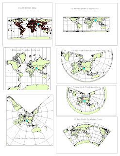
MAP PROJECTIONS
0. GCS WGS 1984
Using the Measure tool from the Tools toolbar, about how many miles does the equator span? What about the northern- or southern-most graticule line on the map? What do these two lines in fact represent?
The Equator is approximately 24901.5 miles in length
How far is Washington, D.C. from Kabul now? 6942 miles
1. Mercator Projection Conformal
Notice the differences in the graticule grids (which are all still 30º x 30º), and the changing sizes and shapes of areas (Is Alaska really bigger than Brazil?
No, but in this map projection it seems like it is comparable in size.
What about Greenland?
Greenland’s shape has radically changed and does not seem distorted, but rather the shape is intact.
How far is Washington, D.C. from Kabul now? 10,200 miles.
2. Asia Lambert Conformal Conical
How far is Washington, D.C. from Kabul now? 8294miles
This map distorts the rest of the world while trying to keep Asia as its main focus.
3. World Cylindrical Equal Area
How far is Washington, D.C. from Kabul now? 10149 miles
4. Asia North Albers Equal Area Conic
How far is Washington, D.C. from Kabul now? 6801 miles
5. Asia North Equidistant Conic
How far is Washington, D.C. from Kabul now? 6730 miles
6. Asia South Equidistant Conic
How far is Washington, D.C. from Kabul now? 9410 miles plus 1685 miles which is roughly 11095. This is because the map projection cut off the Atlantic Ocean so I am forced to go to the edges of the maps and add from there.
Write four paragraphs about the significance of map projections. Be sure to reference your six maps as examples.
There are different map projections that can be used for specific situations. Since some projection retain different characteristics, it is vital to choose the correct projection that is best suited for your objective. The map projection is conformal when parallels and meridians intersect at right angles. Also for conformal the local shapes and angles are preserved locally. Then, when areas on a map maintain the same proportional relationship to the areas on the Earth that they represent, the map is considered equal area. For the maps of equal areas, all regions are shown in the same proportion to their true areas. If a coin is placed on any area of this type of map, it will cover the same and as much of the area on the surface of the sphere as it would if it were placed elsewhere on the map. Shapes, angles, and scale must be distorted on most parts of such a map. Another projection is called equidistant and it is when map distances from the center of the projection to any other place on the map are uniform in all directions.
The maps from 0 to 6 show different map projections and are labeled accordingly. Each projection holds different traits that are true, but will nonetheless have distortions within them. The purple dot stands for Washington D.C. in the United States, while the highlighted blue dot is Kabul, Afghanistan.
For the Conformal maps, I have decided to put up the map projections of Mercator Projection Conformal and Asia Lambert Conformal Conical. The Mercator projection has 90-degree intersections with longitude and latitude also known as parallels and meridians. The shape of the countries was maintained to look presentable. There is little area distortion along the equator, but huge area distortion in the polar areas. Standard for marine charts and recommended and used for regions predominantly bordering the equator since they are recommended for navigation because of straight lines. Usually it is also incorrectly used for world atlases and wall maps. The next conformal map is the Asia Lambert one that shows that the local shape and angles are preserved. In this case, the area of Asia is preserved and it is the map focus of this map projection. This map may be vital for looking at domestic trade or looking at the area around Asia since the local shapes are most important in this projection. It is true only along the chosen standard parallels. These parallels are those free of distortion. Free of distortion along either of the two chosen parallels. But the distortion of shapes and areas is minimal surrounding the standard parallels, but increases further away. Used extensively for mapping countries or regions with a mainly east to west extent or large-scale mapping.
For the Equal Area map projections, I used the World Cylindrical Equal Area and Asia North Albers Equal Area Conic. The World Cylindrical Equal Area map when areas on a map maintain the same proportional relationship to the areas on the Earth that they represent. This projection depicts regions shown in the same proportion to their true areas. Shapes, angles, and scale must be distorted on most parts of such a map. For the Asia North Albers Equal Area Conic, the scale is true only along the chosen standard parallels. It is good that it is free of distortion along either of the two chosen parallels. As an equal-area projection, all areas are proportional to the same areas on the earth. It is mostly used for maintaining an equal-area representation of large countries or regions with a mainly east to west extent. It is also used for many thematic maps due to its equal-area characteristics. When looking at my map projection #3 and #4, I can see that the area is preserved, yet the other features such as shape are not.
The equidistant map projections include Asia South Conic and Asia North Conic. The Asia South focuses more on the southern region of the continent while Asia North focuses on the northern region. The scale shows true only along the chosen standard parallels and along all meridians. But the distortion is a compromise between equal-area and conformal but it is free of distortion along either of the two standard parallels, but increases further away. The shapes of the continents are also distorted drastically. It is commonly used for mapping areas in the middle latitudes such as parts of Asia. For number 6, the Asia South Equidistant Conic map projection, it was curved differently than the Asia North map projection and I ultimately had to measure the distance for Washington D.C. to Kabul with a different method consisting of adding the measurements as I went from the Kabul to the left edge and then from the right edge to D.C. since it was cutting between the Atlantic Oceans. They may have done this with the map projection possibly to maintain a certain feature that was relevant to the map.
For all the different map projections, you will maintain some features but have some feature distorted at the same time. You have to choose the correct map in accordance with your objective since some maps may fit your need a little better than others. Many of my map projections revolved around the continent of Asia because I wanted to see how the different map projections varied and remain similar for a given focused area.


