Thursday, May 27, 2010

Final Lab: Percentages of Race: Continental U.S. Counties


Descriptions of Each Map

For the thematic maps of the census, I went with different percentage rates of the Black, Asian, and some other race alone in comparison to the overall population of the counties of the United States. The top map is the one on the Black race, the middle map is the one on the Asian race, and the bottom map is the one about some other races alone census.
The Black race map shows a high population in the southern to eastern regions of the United States. The legend within the map has the percentage break downs and the areas that are colored RED have counties that have over 50% Black. The ORANGE filled counties show that there is between 30 to 50 percent of the population is Black. If the bottom end of the spectrum is taken into account, from percentages ranging from >10%, we can see that there is very little of the Black race in the plains and central west.
The Asian race map shows high concentrations of the race in Los Angeles County as well as the counties in Northern California near San Francisco. A little bit of background history can explain why this is the matter, it is due to the fact that many Asian immigrants immigrated here to Angel Island. The Northern California region shows high percentages ranging from 20 to 46%. There are also pockets of Asian race in the south of Texas and north of the east coast.
The Some Other Race alone census, also known as Hispanics, show prominence in Southern California and counties in Texas. The highest spectrum for counties with this race is between 22 to 40 percent. This can be due to the fact that the country of Mexico borders these relative states. As the map indicates, the percentages drop as you go farther north and east.
The census maps here show percentages of different races in relation to their population in their counties. If I were to conduct a study looking at income levels of different counties of the United States, I would definitely use this chloropleth map to see if race plays a factor.

Concluding discussion about your census map series

The census map series seems to be very applicable in the in real world situations and if you were going to figure out statistics of people. I feel that the chloropleth map is a good map to be used in this situation because of the distinctions and different values that can be distinctly classified. I enjoy learning about statistics of our nation because it is interesting, culturally, historically and socially to understand why people are where they are.

Overall impressions of GIS

I am very impressed with the hand on technique that I felt in this class, and the topic of GIS is very interesting because I feel that it is very applicable to many things ranging from the environment to business. Geographic information systems are a great way of conducting spatial analysis with the impressive technology that it has at hand with ArcGIS. I definitely have been impressed and I will definitely attempt to minor in GIS because of its technical laden value and the ability to apply it to many things with spatial analysis as the driving force.

Monday, May 24, 2010

week 8 Lab 7


National Broadcast Company of Los Angeles reported that on August 26, the Station Fire tormented Los Angeles. It was determined that it was caused by arson, it has burned through 250 square miles, killed two firefighters, injured 11 people, destroyed 89 homes and forced thousands of evacuations. The main purpose of my GIS map is to spatially analyze how close places of worship, such as churches and temples were in the path of the blaze. CBS stated that firefighters were stationed at Tujunga's "Rustic" neighborhood late Tuesday morning, as flames were inching down toward some 300 homes. Homes on the northern edge of Glendale were also threatened, as well as places of worship that people held dear to their hearts and spirituality were in the line of danger.
By August 30, the Station Fire was spreading north of Los Angeles into the Angeles Crest Forest. Which is a good sign since most of the structures were south of the fire. The tall and pillowy clouds were caused by heat from the fire and the destructive power of the fire needed to be dealt with so places of worship with in a two-mile proximity should be evacuated for safety measures. I created two buffer zones one with a 10,000-foot zone that is shown in light brown. This buffer zone has probable evacuation status since it is within the 10,000 feet (1.9 mile) zone.
The other buffer zone is the 15,000 feet range (shown in light yellow), which expects churches and temples to be on the lookout for flames. The evacuation status is probable but it is not as pressing as the ones that are in the light brown area.
Depending on the conditions the rate, direction and speed of the fire can change, so we can not take any risks and we should act on evacuating and deeming certain locations uninhabitable until the fire is contained. INCIWEB.com stated that Southern California frequently experiences quick-moving brush fires and grass fires, which burn in finer and thinner fuels. The Station Fire, burning on National Forest lands, is truly a “forest fire”, yet structure are still affected and are of the utmost concern in this GIS map.
The Station Fire turned vicious the night of August 30, spreading in three directions, doubling in size and killing two firefighters. If there had been drought conditions, like in Southern California, and if there were high winds, then the fires will spread very quickly. By August 31, the hotspots had spread east, west and north, showing the movement of the fire overnight. The flames, just west of Mt. Wilson, created a large plume of smoke and threatened the famed observatory and broadcast towers on the top of Mt. Wilson. On September 2, a full week after the Station Fire began, a combination of smoke and clouds hovered over much of Los Angeles County. By Sept. 6, the Station Fire had been burning for two weeks and had spread to more than 250 square miles. Finally, the fire slowly got weaker and containment was in sight.
Fortunately, things were changing in our favor, since Los Angeles Times.com stated that La Cañada Flintridge residents expressed their gratitude to firefighters with a sign in the front yard of one Ocean View Boulevard home saying “Thank you for saving Paradise Valley.” The mandatory evacuation order for the neighborhood was lifted Tuesday morning. This showed hope and the need for an evacuation was necessary for the neighborhoods around the area of the Station Fire.
Wikipedia.com stated that the blaze threatened 12,000 structures in the National Forest and the nearby communities of La Cañada Flintridge, Glendale, Acton, La Crescenta, Littlerock and Altadena, as well as the Sunland and Tujunga neighborhoods of the City of Los Angeles. Many of these areas faced mandatory evacuations as the flames drew near, but as of September 6, all evacuation orders were lifted. The facts prove that the Station Fire, north of Los Angeles, was the largest and deadliest of these wildfires, burning 160,577 acres.
The use of Arc GIS in this situation can be very useful in determining which areas are at higher demand for evacuation or assistance. With the buffer feature of Arc GIS, you can spatially analyze imminent problems such as the Station Fire and take action effectively by determining areas that can be affected. Although nature and conditions are sometimes hard to predict, it is better to be safe than sorry. Places or worship are important places to protect because they hold high value in the lives of people, but the actual lives of the people are more important to protect in these catastrophic situations.


Bibliography

"Fire From Space." NBClosangeles. NBC, 01 sep 2009. Web. 27 May 2010. .

"Fire Watch." CBS2. CBS, 02 Sep 2009. Web. 27 May 2010. .

"Fire Map." LAtime.com. Los Angeles Times, 28 Aug 2009. Web. 27 May 2010. .

"The Station Fire." Inciweb.com. Inciweb, 11 Sep 2009. Web. 27 May 2010. .

"California Wildfires." Wikipedia.org. Wikipedia, 21 Sep 2009. Web. 27 May 2010. .

Thursday, May 13, 2010

Week 7 Lab: Projection of Southern California DEMs in ArcGIS


1. The area I have chosen to do my digital elevation model on is the mountainous region of Southern California. It is the area close to the Santa Clarita region and the Angeles National Forest. It is also north of the 210 freeway in Southern California. I chose this specific area of study because I felt that it would depict various ranges in elevation giving the map a more diverse feel of elevation levels.
The extent information (in decimal degrees)
TOP = 34.7133333325
LEFT = -119.0725
RIGHT = -118.381666666
BOTTOM = 34.2827777769
Geographic Coordinate System
GCM North America 1983

Thursday, May 6, 2010

Week 6 Map Projections


2 conformal
- Mercator
- Asia Lambert Conformal

2 equal area
- World Cylindrical Equal Area
- Asia North Albers Equal Area Conic

2 equal distant
- Asia North Equidistant Conic
- Asia South Equidistant Conic

MAP PROJECTIONS

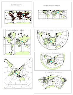
0. GCS WGS 1984

Using the Measure tool from the Tools toolbar, about how many miles does the equator span? What about the northern- or southern-most graticule line on the map? What do these two lines in fact represent?
The Equator is approximately 24901.5 miles in length

How far is Washington, D.C. from Kabul now? 6942 miles

1. Mercator Projection Conformal

Notice the differences in the graticule grids (which are all still 30º x 30º), and the changing sizes and shapes of areas (Is Alaska really bigger than Brazil?
No, but in this map projection it seems like it is comparable in size.

What about Greenland?
Greenland’s shape has radically changed and does not seem distorted, but rather the shape is intact.

How far is Washington, D.C. from Kabul now? 10,200 miles.

2. Asia Lambert Conformal Conical

How far is Washington, D.C. from Kabul now? 8294miles

This map distorts the rest of the world while trying to keep Asia as its main focus.

3. World Cylindrical Equal Area

How far is Washington, D.C. from Kabul now? 10149 miles

4. Asia North Albers Equal Area Conic

How far is Washington, D.C. from Kabul now? 6801 miles

5. Asia North Equidistant Conic

How far is Washington, D.C. from Kabul now? 6730 miles

6. Asia South Equidistant Conic

How far is Washington, D.C. from Kabul now? 9410 miles plus 1685 miles which is roughly 11095. This is because the map projection cut off the Atlantic Ocean so I am forced to go to the edges of the maps and add from there.


Write four paragraphs about the significance of map projections. Be sure to reference your six maps as examples.

There are different map projections that can be used for specific situations. Since some projection retain different characteristics, it is vital to choose the correct projection that is best suited for your objective. The map projection is conformal when parallels and meridians intersect at right angles. Also for conformal the local shapes and angles are preserved locally. Then, when areas on a map maintain the same proportional relationship to the areas on the Earth that they represent, the map is considered equal area. For the maps of equal areas, all regions are shown in the same proportion to their true areas. If a coin is placed on any area of this type of map, it will cover the same and as much of the area on the surface of the sphere as it would if it were placed elsewhere on the map. Shapes, angles, and scale must be distorted on most parts of such a map. Another projection is called equidistant and it is when map distances from the center of the projection to any other place on the map are uniform in all directions.
The maps from 0 to 6 show different map projections and are labeled accordingly. Each projection holds different traits that are true, but will nonetheless have distortions within them. The purple dot stands for Washington D.C. in the United States, while the highlighted blue dot is Kabul, Afghanistan.
For the Conformal maps, I have decided to put up the map projections of Mercator Projection Conformal and Asia Lambert Conformal Conical. The Mercator projection has 90-degree intersections with longitude and latitude also known as parallels and meridians. The shape of the countries was maintained to look presentable. There is little area distortion along the equator, but huge area distortion in the polar areas. Standard for marine charts and recommended and used for regions predominantly bordering the equator since they are recommended for navigation because of straight lines. Usually it is also incorrectly used for world atlases and wall maps. The next conformal map is the Asia Lambert one that shows that the local shape and angles are preserved. In this case, the area of Asia is preserved and it is the map focus of this map projection. This map may be vital for looking at domestic trade or looking at the area around Asia since the local shapes are most important in this projection. It is true only along the chosen standard parallels. These parallels are those free of distortion. Free of distortion along either of the two chosen parallels. But the distortion of shapes and areas is minimal surrounding the standard parallels, but increases further away. Used extensively for mapping countries or regions with a mainly east to west extent or large-scale mapping.
For the Equal Area map projections, I used the World Cylindrical Equal Area and Asia North Albers Equal Area Conic. The World Cylindrical Equal Area map when areas on a map maintain the same proportional relationship to the areas on the Earth that they represent. This projection depicts regions shown in the same proportion to their true areas. Shapes, angles, and scale must be distorted on most parts of such a map. For the Asia North Albers Equal Area Conic, the scale is true only along the chosen standard parallels. It is good that it is free of distortion along either of the two chosen parallels. As an equal-area projection, all areas are proportional to the same areas on the earth. It is mostly used for maintaining an equal-area representation of large countries or regions with a mainly east to west extent. It is also used for many thematic maps due to its equal-area characteristics. When looking at my map projection #3 and #4, I can see that the area is preserved, yet the other features such as shape are not.
The equidistant map projections include Asia South Conic and Asia North Conic. The Asia South focuses more on the southern region of the continent while Asia North focuses on the northern region. The scale shows true only along the chosen standard parallels and along all meridians. But the distortion is a compromise between equal-area and conformal but it is free of distortion along either of the two standard parallels, but increases further away. The shapes of the continents are also distorted drastically. It is commonly used for mapping areas in the middle latitudes such as parts of Asia. For number 6, the Asia South Equidistant Conic map projection, it was curved differently than the Asia North map projection and I ultimately had to measure the distance for Washington D.C. to Kabul with a different method consisting of adding the measurements as I went from the Kabul to the left edge and then from the right edge to D.C. since it was cutting between the Atlantic Oceans. They may have done this with the map projection possibly to maintain a certain feature that was relevant to the map.
For all the different map projections, you will maintain some features but have some feature distorted at the same time. You have to choose the correct map in accordance with your objective since some maps may fit your need a little better than others. Many of my map projections revolved around the continent of Asia because I wanted to see how the different map projections varied and remain similar for a given focused area.

Monday, May 3, 2010

Lab Week 4


This was my first experience with ArcMap and I found it rather intuitive, interesting and interactive. The program allows users to become creative and it also allows users to perform spatial analysis as well as other urban planning projects. I honestly think that this program is really cool and fun. I have always loved the idea of making map projections and creatively making things with computer software.
The potentials of GIS can be used to achieve many things ranging from calculating population density in regions to looking at decibel levels from an airport affecting schools. I like how it can help with urban planning and this field of study is currently very high demand with businesses. I feel like this program can help me gain some cutting edge technical knowledge about the whole idea of what geographic information systems truly is. The technology seems state- of- art and seems like it would be very vital and have great potential with futures in satellite imagery and global positioning systems.
The pitfalls of GIS can probably range from this technical procedure being very tedious and time consuming. I felt that it would take a lot of practice and trial and error to figure it out and master the GIS programming. I got very frustrated the first time using it since I feel that I am not very computer savvy but I feel that with practice I can apprehend these skills. Some of my friends that have taken intermediate and advanced GIS have told me that they have taken hours on certain projects and it is just basically very time consuming and if you make some small mistake, you may have to redo big steps. I find the task daunting and tedious but I feel that I can work through it.
I feel that if I can learn and master GIS programming, I can possibly make a career out of it since I hear that GIS is a hot market nowadays. I think that this would be a very interesting career field to get involved in because I feel that GIS can be very versatile and can be applicable to many fields in the world ranging from the environment to business planning. I feel like it will continue to frustrate me before I can feel completely comfortable but I’m still having fun.

Thursday, April 15, 2010

Lab 3 Neo Geography: My Own Map of Restaurants Options For My Girlfriend's Anniversary Date


View Restaurants Options For My Girlfriend's Anniversary Date in a larger map
Also, write a commentary (two paragraph minimum) about the pitfalls, potential and consequences of neogeography.

Neogeography has been blurring the line between the producers, communicators and consumers of geographic information. The new web 2.0 lets users interact between the world wide web. The relationship between professional and amateur is different across thi area. Geography is familiar to everyone, and the compilation of geographic data have become easier to obtain.
The new technology that is used for neo geography can be used by everyone from MapQuest to Google Maps, and it is a lot cheaper than buying a physical map. However I feel that as people are more dependent on virtual maps, they will also end up losing their sense of direction. People nowadays are very reliable on GPS systems and neogeographical technology that if it all stopped working, they would not have that good of a sense of direction and may end up being more lost than ever. I feel that the pitfalls of neo geography can include having information on the web that may not be as reliable. Since information can be volunteered by amateurs, the information may not be that reliable.
However, in the end i feel that neogeography and all associated technology will help direct people in their lives in a better and more efficient manner. It will give people the ability to have the world in their hands and they will be able to travel the world from their couch at home. It will also reduce the paper usages used in physical maps. The potential for neo geography is very beneficial for everyday uses, I know i use it almost every other day!

Thursday, April 8, 2010

Week 2 Lab: USGS Topographic maps

1. What is the name of the quadrangle?
Beverly Hills Quadrangle

2. What are the names of the adjacent quadrangles?
Canoga Park, Van Nuys, Burbank, Topanga, Hollywood, Pacific Ocean, Venice and Inglewood

3. When was the quadrangle first created? 1966

4. What datum was used to create your map? NAD 27 and NAD 83

5. What is the scale of the map? 1:24,000

6. At the above scale, answer the following:
a) 5 centimeters on the map is equivalent to how many meters on the ground?
1/24,000 = 5cm/D
D= 24,000 x 5 cm
120,000 cm
120meter

b) 5 inches on the map is equivalent to how many miles on the ground?
1/24,000 = 5in/D
D= 24,000 x 5 inches
120,000 inches = ? miles
so 12 inches = 1 foot
120,000 inches = 10,000 feet
10,000 feet roughly 1.89 miles

c) one mile on the ground is equivalent to how many inches on the map?
1/ 24:000 = D inches/ 1 mile
24,000 D in = 1 mile
1 mile = 5280 ft
D in = 63360 in. / 24000 in
D = 2.64 inches


d) three kilometers on the ground is equivalent to how many centimeters on the map?
12.5 cm

7. What is the contour interval on your map?
Contour interval is 20 feet

8. What are the approximate geographic coordinates in both degrees/minutes/seconds and decimal degrees of: DO CALCULATIONS
a) the Public Affairs Building; 34-04.471 N , 118-26.354 W
degrees/minutes/seconds: 34-04.28.26 N , 118-26.21.24 W
decimal degrees: 34.0745166667 degrees N , 118.439233333 degrees W

b) the tip of Santa Monica pier; 34-00.446 N , 118-30.001 W
degrees/minutes/seconds: 34-00.28.25 N , 118-30.06 W
decimal degrees: 34.00743 degrees N , 118.500 degrees W

c) the Upper Franklin Canyon Reservoir; 34-07.235 N , 118-24.596 W
degrees/minutes/seconds: 34-07.14.1 N , 118-24.35.76 W
decimal degrees: 34.1205 degrees N, 118.409 degrees W

9. What is the approximate elevation in both feet and meters of:
a) Greystone Mansion (in Greystone Park); 560 feet = 170.68800 meters
b) Woodlawn Cemetery; 140 feet = 42.67200 meters
c) Crestwood Hills Park; 800 feet = 243.84 meters

10. What is the UTM (Universal Transfer Mercador) zone of the map? Zone 11

11. What are the UTM coordinates for the lower left corner of your map? 3,763,000 meters UTM north and 361,500 meters UTM east

12. How many square meters are contained within each cell (square) of the UTM gridlines? 1,000,000 square meters in each cell OR 1 square km!

13. Obtain elevation measurements, from west to east along the UTM northing 3771000, where the eastings of the UTM grid intersect the northing. Create an elevation profile using these measurements in Excel (hint: create a line chart). Figure out how to label the elevation values to the two measurements on campus. Insert your elevation profile as a graphic in your blog.


14. What is the magnetic declination of the map? +14 degrees

15. In which direction does water flow in the intermittent stream between the 405 freeway and Stone Canyon Reservoir? The stream flows southward.

16. Crop out (i.e., cut and paste) UCLA from the map and include it as a graphic on your blog.